Making ubuntu.com responsive: testing on multiple devices (15)
Inayaili de León Persson
on 18 June 2014
Tags: Design
This post is part of the series ‘Making ubuntu.com responsive‘.
When working on a responsive project you’ll have to test on multiple operating systems, browsers and devices, whether you’re using emulators or the real deal.
Testing on the actual devices is preferable — it’s hard to emulate the feel of a device in your hand and the interactions and gestures you can do with it — and more enjoyable, but budget and practicability will never allow you to get a hold of and test on all the devices people might use to access your site.
We followed very simple steps that anyone can emulate to decide which devices we tested ubuntu.com on.
Numbers
You can quickly get a grasp of which operating systems, browsers and devices your visitors are using to get to your site just by looking at your analytics.
By doing this you can establish whether some of the more troublesome ones are worth investing time in. For example, if only 10 people accessed your site through Internet Explorer 6, perhaps you don’t need to provide a PNG fallback solution. But you might also get a few less pleasant surprises and find that a hard-to-cater-for browser is one of the preferred ones by your customers.
When we did our initial analysis we didn’t find any real surprises, however, due to the high volume of traffic that ubuntu.com sees every month even a very small percentage represented a large number of people that we just couldn’t ignore. It was important to keep this in mind as we defined which browsers, operating systems and devices to test on, and what issues we’d fix where.
| Browser | Percentage usage | |
|---|---|---|
| Chrome | 46.88% | |
| Firefox | 36.96% | |
| Internet Explorer | Total | 7.54% |
| 11 | 41.15% | |
| 8 | 22.96% | |
| 10 | 17.05% | |
| 9 | 14.24% | |
| 7 | 2.96% | |
| 6 | 1.56% | |
| Safari | 4.30% | |
| Opera | 1.68% | |
| Android Browser | 1.04% | |
| Opera Mini | 0.45% | |
| Operating system | Percentage usage | |
|---|---|---|
| Windows | Total | 52.45% |
| 7 | 60.81% | |
| 8.1 | 14.31% | |
| XP | 13.3% | |
| 8.84 | 8.84% | |
| Vista | 2.38% | |
| Linux | 35.4% | |
| Macintosh | 6.14% | |
| Android | Total | 3.32% |
| 4.4.2 | 19.62% | |
| 4.3 | 15.51% | |
| 4.1.2 | 15.39% | |
| iOS | 1.76% | |
| Device | Percentage usage (of 5.41%) |
|---|---|
| Apple iPad | 17.33% |
| Apple iPhone | 12.82% |
| Google Nexus 7 | 3.12% |
| LG Nexus 5 | 2.97% |
| Samsung Galaxy S III | 2.01% |
| Google Nexus 4 | 2.01% |
| Samsung Galaxy S IV | 1.17% |
| HTC M7 One | 0.92% |
| Samsung Galaxy Note 2 | 0.88% |
| Not set | 16.66% |
After analysing your numbers, you can also define which combinations to test in (operating system and browser).
Go shopping
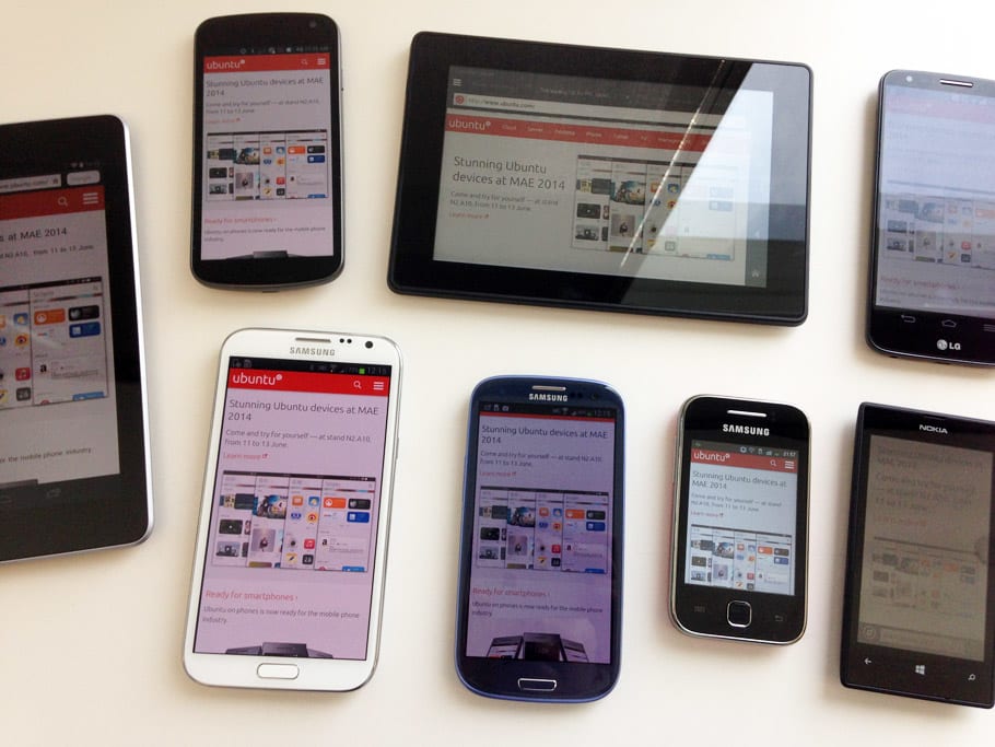
Based on the most popular devices people were using the access our site, we made a short list of the ones we wanted to buy first. We weren’t married to the analytics numbers though: the idea was to cover a range of screen sizes and operating systems and expand as we went along.
- Nexus 7
- Samsung Galaxy S III
- Samsung Galaxy Note II
We opted for not splashing on an iPad or iPhone, as there are quite a few around the office (retina and non-retina) and the money we saved meant we could buy other less common devices.
 Part of our current device suite.
When we started to get a few bug reports from Android Gingerbread and Windows phone users, we decided we needed phones with those operating systems installed. This was our second batch of purchases:
- Samsung Galaxy y
- Kindle Fire HD (Amazon was having a sale at the time we made the list!)
- Nokia Lumia 520
- LG G2
And, last but not least, we use a Nexus 4 to test on Ubuntu on phones.
We didn’t spend much in any of our shopping sprees, but have managed to slowly build an ever-growing device suite that we can test our sites on, which is invaluable when working on responsive projects.
Alternatives
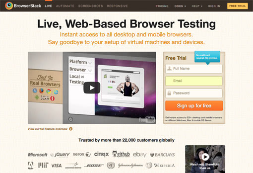
Some operating systems and browsers are trickier to test on in native devices. We have a BrowserStack account that we tend to use mostly to test on older Windows and Internet Explorer versions, although we also test Windows on virtual machines.
 BrowserStack website.
Tools
We have to confess we’re not using any special software that synchronises testing and interactions across devices. We haven’t really felt the need for that yet, but at some point we should experiment with a few tools, so we’d like to hear suggestions!
Browser support
We prefer to think of different levels (or ways) of access to the content rather than browser support. The overall rule is that everyone should be able to get to the content, and bugs that obstruct access are prioritised and fixed.
As much as possible, and depending on resources available at the time, we try to fix rendering issues in browsers and devices used by a higher percentage of visitors: degree of usage defines the degree of effort fixing rendering bugs.
And, obviously: dowebsitesneedtolookexactlythesameineverybrowser.com.
Read the final post in this series: “Making ubuntu.com responsive: final thoughts”
Reading list
Talk to us today
Interested in running Ubuntu in your organisation?
Newsletter signup
Related posts
From inspiration to impact: design students from Regent’s University London explore open design for their dissertation projects
Last year, we had the opportunity to speak at Regent’s UX Conference (Regent’s University London’s conference to showcase UX work by staff, students, and...
Showcasing open design in action: Loughborough University design students explore open source projects
Last year, we collaborated with two design student teams from Loughborough University in the UK. These students were challenged to work on open source project...
Design and Documentation clinics at FOSDEM Fringe 2026
FOSDEM is one of the biggest and most exciting open source events of the year, held at the Solbosch campus of the Université Libre de Bruxelles (Brussels),...
