The new Ubuntu Resources
Inayaili de León Persson
on 18 November 2013
Tags: Design
Today we’ve launched the alpha version of our latest project: the Ubuntu Resources website.
This is our first responsive project that follows the mobile-first methodology and we’re very excited to share this with everyone!
As you’ll be able to see, we’re not quite done with it yet, but we wanted to share what we’ve created so far, so we can get feedback and keep improving the design and expanding the features.
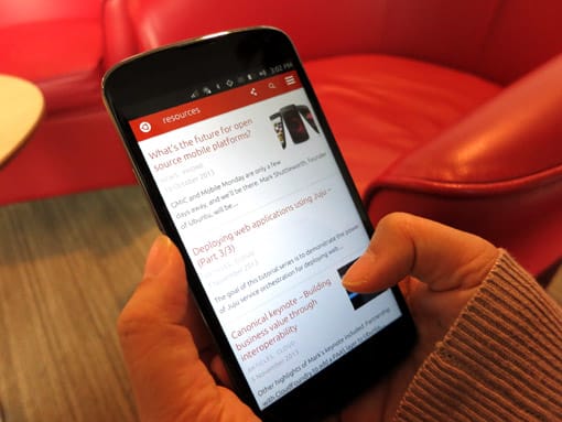
 The new Ubuntu Resources on an Ubuntu-powered phone
A little bit of background
This project grew from the need to separate content like case studies, news, press releases and events, from the core of the Canonical and Ubuntu sites — and it will eventually replace much of what currently is at insights.ubuntu.com. As the site is designed for reading and engaging with longer pieces of content, we thought it would be the ideal place to explore mobile-first and responsive approaches. And we plan to use what we’ve learned from it to make www.ubuntu.com and our Web Style Guide responsive.
Scaling things down
We started the research phase taking a holistic view of the project, trying to understand what types of content and users we wanted to target. We realised that with limited time and resources we would have to divide the project into different releases, so that we could make sure each aspect of the site was given the attention it deserved.
The first and current release of the site — alpha — focuses solely on small screens. The main goal is that all the content is accessible and the visual style and features will be progressing and being added as we go.
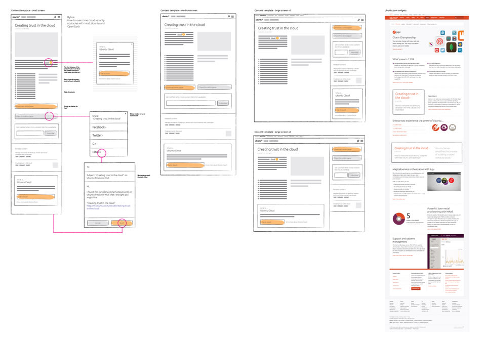
 Initial wireframes across a variety of screen sizes
Reusing existing styles
One of the challenges in this project was deciding how we were going to integrate the existing Web Style Guide, which we’ve been using internally for a while now and will be made public on design.ubuntu.com soon.
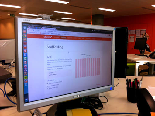
 Sneak peek of our Web Style Guide
We decided to use a minimal version of the style guide that kept the Ubuntu Resources’ style coherent with www.ubuntu.com and that we could improve on.
You’ll also notice small details that align with our phone design, like the grid, navigation selection and icons, and we’ll be adding even more in the upcoming releases.
What’s coming
Apart from working on the larger screen versions of the site, some of the things we will be looking into for the next iterations are:
- the ability to subscribe to different types of content
- more curated topic landing pages
- content filtering and sorting
- cleaner URLs
- the way we handle PDFs and other file formats
- more content like a press section
Go and have a look at the site and let us know your thoughts. We want to know what you like and what you think can be improved, or any other comments you might have — we’ve included a handy link to the feedback form at the bottom of every page. Enjoy!
Talk to us today
Interested in running Ubuntu in your organisation?
Newsletter signup
Related posts
From inspiration to impact: design students from Regent’s University London explore open design for their dissertation projects
Last year, we had the opportunity to speak at Regent’s UX Conference (Regent’s University London’s conference to showcase UX work by staff, students, and...
Showcasing open design in action: Loughborough University design students explore open source projects
Last year, we collaborated with two design student teams from Loughborough University in the UK. These students were challenged to work on open source project...
Design and Documentation clinics at FOSDEM Fringe 2026
FOSDEM is one of the biggest and most exciting open source events of the year, held at the Solbosch campus of the Université Libre de Bruxelles (Brussels),...
